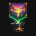
Logo: clean edges at 1×1
The MapKluss logo shows when disabling dithering preserves bold shapes and clean edges.
 MAPKLUSSMINECRAFT MAP ART WORKSHOP
Quality
There is no universal best dithering mode for map art. Logos, anime art, photos, and pixel art behave differently, so the right choice depends on the image and on how clean you need the build to be.
MapKluss lets you switch modes quickly and compare the result before exporting. That matters because the wrong dithering can either destroy clean edges or oversimplify a detailed image.
The MapKluss logo shows when disabling dithering preserves bold shapes and clean edges.
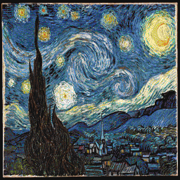
3D Stair with Stucki preserves the brushwork’s motion and expands the blue and yellow range.
When clean edges, simple fills, and predictable block usage matter most. This is especially useful for logos, icons, and pixel art.
Photos usually contain softer gradients and more half-tones. Without the right dithering, they can look too flat after being reduced to the Minecraft palette.
Not really. The same mode can work well on anime art but poorly on logos or photos, so preview-based comparison stays essential.